The Comprehensive Guide to Creating Landing Pages That Convert

In today's competitive digital landscape, landing pages play a crucial role in driving conversions. Whether you want users to sign up for a newsletter, download an eBook, or make a purchase, a well-designed landing page can significantly boost your chances of success. But what makes a landing page high-converting? This guide will walk you through the essential elements of creating landing pages that convert visitors into leads, subscribers, or customers.
Key Elements of a High-Converting Landing Page
Benefits of Using High Converting Landing Pages for Your Business?
What is a Landing Page?
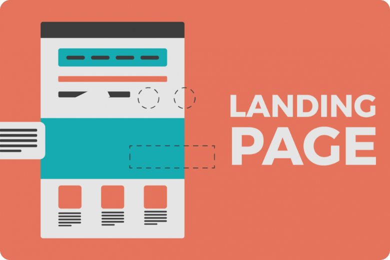
A landing page is a standalone web page designed specifically for a marketing or advertising campaign. Unlike a typical webpage, its sole focus is to guide visitors towards a specific call-to-action (CTA), like -
- Filling out a form
- Signing up for a service
- Making a purchase.
- Downloading a resource
Landing pages are typically disconnected from the rest of the website’s navigation, keeping visitors' attention solely on the offer at hand. They can be used for various campaigns, including PPC ads, social media promotions, email marketing, and more.
Why are Landing Pages Important for Conversions?
Unlike homepages or service pages, landing pages are highly targeted. When done right, they focus on one goal (conversion) without distracting the user.

Key Elements of a High-Converting Landing Page
To create an effective landing page, you need to focus on a few critical elements. Let’s explore the components that will make your landing page stand out and convert more visitors:
- A Clear and Compelling Headline
The headline is the first thing visitors see when they land on your page. A strong headline grabs attention and clearly communicates what your page is offering. It should:- Be short and to the point
- Highlight the benefit of your offer
- Match the intent of the ad or link that brought users to the page
- Subheadline or Supporting Text
Directly beneath your headline, you can include a subheadline or supporting text that provides more context. This should further explain your offer and build on the excitement or urgency created by the headline. Keep this text concise but informative.
For example for the Headline - “Unlock the Secrets to Digital Marketing Success – Get Your Free eBook Now!”, the supporting text can be -
"Are you ready to elevate your marketing game and achieve remarkable results? Our free eBook is packed with invaluable insights and proven strategies that will guide you through the ever-evolving digital landscape.
Inside, you’ll find:- Key marketing fundamentals
- Insights for smarter decision-making
- Tips from industry leaders
- Real-world success stories”
- A Strong and Focused Call-to-Action (CTA)
Your CTA is arguably the most important element of your landing page. It’s the action you want visitors to take—whether it’s downloading an eBook, signing up for a newsletter, or purchasing a product.
- Make your CTA clear and direct (e.g., "Download Now," "Get Started," or "Sign Up Today").
- Use action-oriented language.
- Place the CTA button above the fold (visible without scrolling) for quick access.
- If possible, include multiple CTA buttons throughout the page for longer landing pages.
- Engaging Visuals
People process visuals faster than text, so using high-quality images, graphics, or videos can enhance the appeal of your landing page. Make sure your visuals:
- Support the message of the page.
- Are high-resolution and optimized for fast loading.
- Include a video if applicable—videos can improve conversion rates by up to 80%.
- Avoid using distracting or irrelevant images that detract from the CTA.
- Benefits-Oriented Copywriting
Your landing page copy needs to focus on the benefits of your offer rather than the features. Instead of just listing product specifications, explain how the product or service will solve the visitor's problems or improve their life.
Use short, scannable text with bullet points or icons to break up large blocks of content. This helps to keep your message concise and easy to digest. - Social Proof and Trust Signals
Including social proof elements like testimonials, customer reviews, or case studies can help build trust and credibility with your audience. You can also use logos of reputable companies that have used your product or service, or display certifications and awards. This helps to reassure visitors that others have benefited from your offer. - A Mobile-Friendly Design
With more than half of web traffic coming from mobile devices, it’s essential that your landing page is optimized for mobile users. A responsive design ensures that your page looks and functions well on smartphones and tablets.- Ensure fast load times by optimizing images and reducing heavy scripts.
- Simplify the layout for easy navigation on smaller screens.
- Make CTA buttons big enough to be tapped easily on mobile devices.
- Simple and Concise Forms
If your landing page requires visitors to fill out a form, keep it short and easy to complete. The more fields you ask for, the less likely people are to fill out the form.- Only ask for essential information (name and email, for example).
- Use progressive profiling if you're gathering more information over time.
- Consider using multistep forms, which break long forms into multiple steps, making the process feel less overwhelming.
- Urgency and Scarcity
Creating a sense of urgency can encourage visitors to take action sooner rather than later. You can do this by offering:
- Limited-time offers ("Get 50% off, only until Friday!").
- Scarcity indicators ("Only 3 spots left!").
- Countdown timers for events, webinars, or sales.
Benefits of Using High Converting Landing Pages for Your Business?
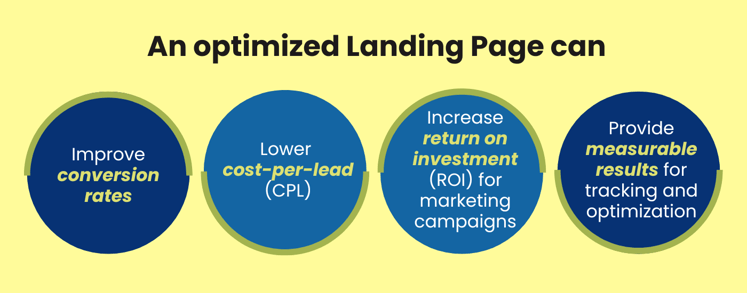
High-converting landing pages are not just a tool for increasing conversions. By offering targeted messaging, clear CTAs, and a seamless user journey, landing pages have the power to elevate your business’s digital presence, boost sales, and drive sustained growth over time. Some of the benefits of using high-converting landing pages for your business are -
- Increased Conversions
- Targeted Messaging: High-converting landing pages focus on a specific audience segment, offering tailored solutions that drive higher conversion rates.
- Focused Call-to-Action (CTA): With clear CTAs, landing pages encourage visitors to take desired actions such as signing up, purchasing, or downloading content.
- Improved ROI
- Cost-Efficient Marketing: By converting a higher percentage of visitors, you maximize the return on investment (ROI) from your marketing campaigns.
- Lead Generation: They help capture leads effectively through opt-in forms, email subscriptions, or demo requests, which can later be nurtured.
- Better User Experience
- Streamlined Information: High-converting landing pages present concise, relevant information, reducing distractions and guiding users toward the CTA.
- Mobile-Friendly Designs: Optimized landing pages offer smooth experiences across devices, which improves engagement and reduces bounce rates.
- Stronger Data Insights
- A/B Testing: They offer a platform for running A/B tests on elements like CTAs, headlines, and visuals, providing actionable insights on what drives the best results.
- Tracking Performance: You can easily track key performance indicators (KPIs) like traffic, click-through rates, and conversions, helping to fine-tune marketing strategies.
- Enhanced Branding
- Consistent Messaging: High-quality landing pages ensure your brand message is clear and consistent, boosting credibility and trust.
- Visual Impact: A well-designed page with professional images and compelling copy enhances your brand's perception, leading to better engagement.
- Boosted Sales and Revenue
- Targeting Specific Offers: By focusing on a particular product or service, landing pages increase the likelihood of sales from relevant traffic.
- Upselling and Cross-Selling Opportunities: Strategically placed offers and suggestions can drive further purchases, increasing customer lifetime value.
Tips for Optimizing a Landing Page
- Test Different Headlines:
A/B test various headlines to see which one captures attention and drives more conversions.By understanding what captures your audience's attention, you can create compelling headlines that drives engagement. - Optimize Load Times:
Ensure your landing page loads quickly to prevent visitors from leaving due to slow performance. By compressing images, minimizing requests, and leveraging performance tools, you can enhance your landing page speed, keeping visitors engaged and encouraging action. Tools like Google PageSpeed Insights can help analyze performance. - Keep Forms Simple:
Limit the number of fields in your lead capture form to reduce friction and encourage completion. By keeping forms simple, focusing on essential information, and optimizing the user experience, you can significantly improve completion rates and drive conversions on your landing page. - Use Scarcity and Urgency:
Implement tactics like limited-time offers or countdown timers to create a sense of urgency and encourage immediate action. - Monitor Analytics:
Regularly review key metrics such as conversion rates, bounce rates, and user behavior to identify areas for improvement. Use tools like Google Analytics or landing page-specific tools like Unbounce or Instapage to monitor these metrics and gain insights into what’s working and where improvements can be made. - Incorporate A/B Testing:
Continuously test different elements of your landing page, such as CTAs, images, and copy, to optimize performance based on data-driven insights. By testing and iterating, you can discover what resonates best with your audience and make data-driven decisions to optimize your landing page.
FAQs on Landing Pages
- Q1: What’s the difference between a landing page and a homepage?
A landing page is a specific, standalone page designed to achieve a single conversion goal, whereas a homepage serves as the main entry point to a website, containing multiple links and options for visitors. - Q2: How do I know if my landing page is effective?
Track key metrics such as conversion rates, bounce rates, and user engagement. High conversion rates and low bounce rates typically indicate an effective landing page. - Q3: Can I use the same landing page for multiple campaigns?
While you can reuse landing pages, it's best to create tailored pages for different campaigns to ensure the messaging aligns with the specific audience and goals. - Q4: How long should my landing page be?
The length of your landing page depends on the complexity of your offer. Generally, concise pages with essential information perform well, but longer pages may be necessary for more complex products or services. - Q5: How often should I update my landing pages?
Regularly review and update your landing pages based on performance data, market trends, and changes in your audience’s preferences. Continuous optimization helps maintain effectiveness.
Conclusion
A high-converting landing page is the cornerstone of successful online marketing campaigns. By focusing on clear messaging, an engaging CTA, high-quality visuals, and trust-building elements, you can create landing pages that turn visitors into leads or customers. Remember to continuously test and optimize your pages based on performance data to maximize your conversion potential.
Whether you're running ads, promoting content, or driving email sign-ups, a well-designed landing page can dramatically improve your results. Take the time to implement these best practices, and watch your conversions soar!

Puja is an artistic, creative, and passionate Client Success Manager at Inboundsys. She has more than 15 years of experience in web designing and the Ed-Tech platform. Over the years, she has essayed multiple roles, from being a web designer, content writer, teacher, and business analyst to a quality analyst. She has exceptional analytical skills, interpersonal communication skills, and organizational skills. Her keen ability to break down and synthesize information and attention to detail while envisioning the bigger picture makes her a genuine people person and build healthy relationships. She is an eloquent writer and has written many blogs on Ed-Tech and other web technologies. During her free time, she likes reading books on recent technological developments and non–fiction books and satiate her creative instincts through painting and cooking.
